This season will definitely be filled with “earthy neutrals with a range of bold color statements and patterns to reflect a landscape of hope, fun, fantasy and all things neutral,” as said by the well-known Executive Director of the Pantone Color Institute, Leatrice Eiseman in their seasonal color report for Fall 2015.
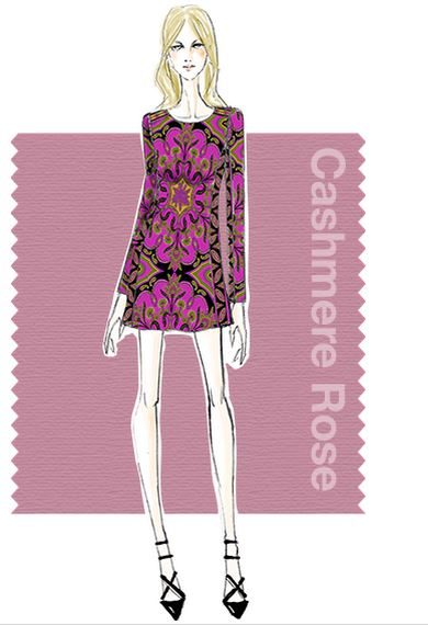
Alice & Trixie, one of the designers who used Cashmere Rose in their Fall Collection
The Pantone Color Institute is widely regarded for providing forecasts on color trends and color insights. They help companies create the most informed decision regarding colors for their brand and product. And in an industry that’s very much concentrated on aesthetics, Pantone is highly influential in the fashion industry. Designers go to Pantone for inspirations and quality information regarding color–an aspect that is of great significance in the sartorial world.
And here are colors you want to add into your wardrobe this season.
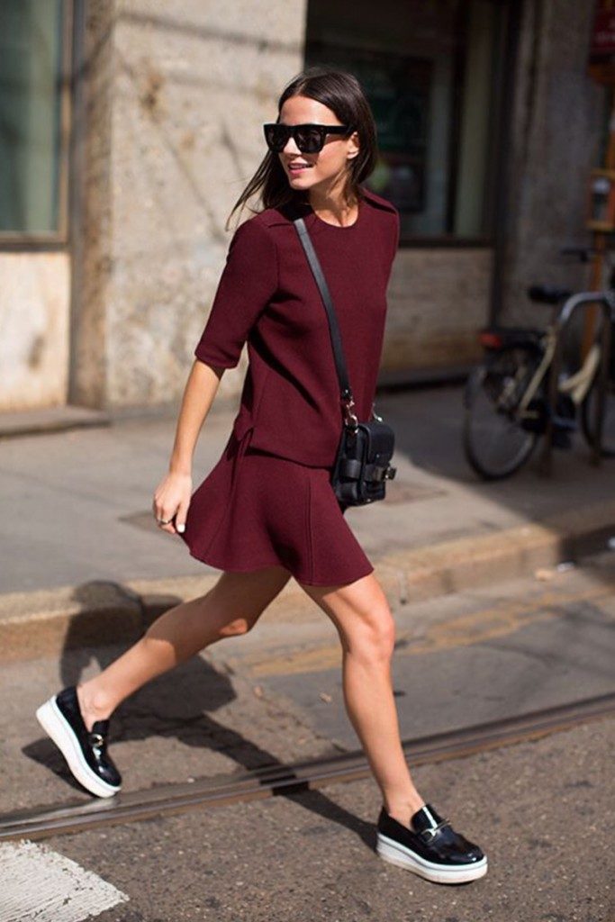
MARSALA 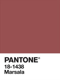
This color is also 2015’s color of the year. Marsala is named after the wine of the same name and same hue. The color is red-brown and full of richness. It is a great combination between burgundy and brick red. Its shade is interesting and contrasts wonderfully well to other hues.
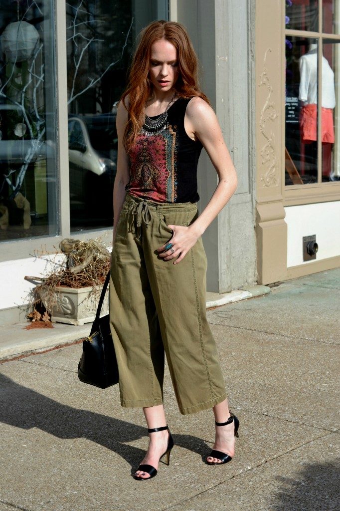
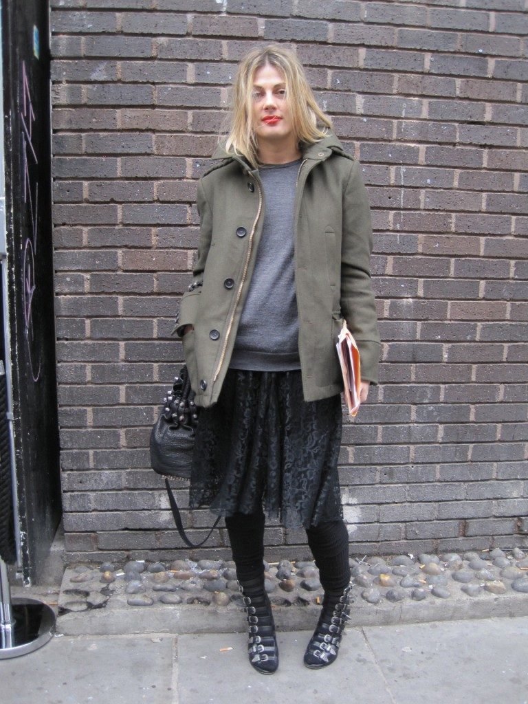
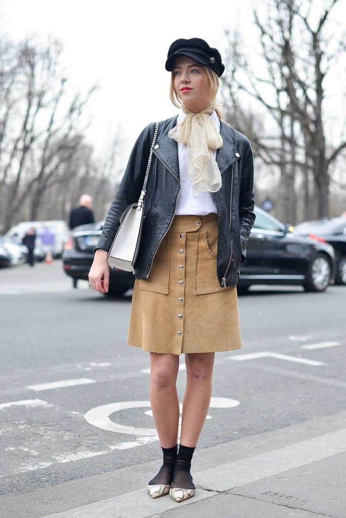
DRIED HERB 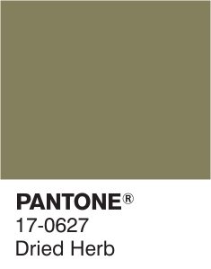
Dried Herb is a khaki-ish military-ish shade of olive green and you might have already been wearing this color as a utility clothes. The color is so organic and close-to-nature yet it also offers its own version of sophistication and chicness. Definitely a great color for outerwear.
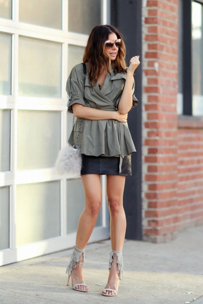
DESERT SAGE 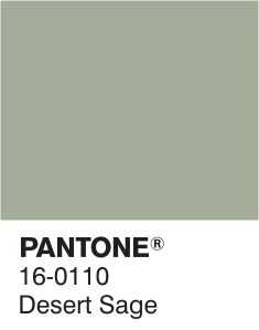
This gray shade has a hint of green hue in it which creates a slightly khaki sense to the color. Nevertheless, Desert Sage is one of the more dull shades amongst this list. But it sure can stand up to its own and create an overall impact to an outfit that’s totally original.
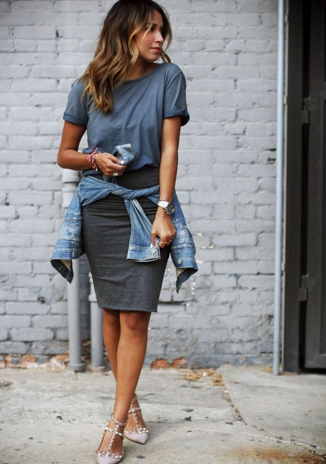
STORMY WEATHER 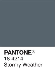
Stormy Weather, as the name suggests, depicts the color of the sky in the midst of a brewing storm. This impression really does suits the atmosphere of autumn season. It is a bluish gray color that gives out a powerful and strong vibe. Something you’d want to take note of for your office outfits for fall.
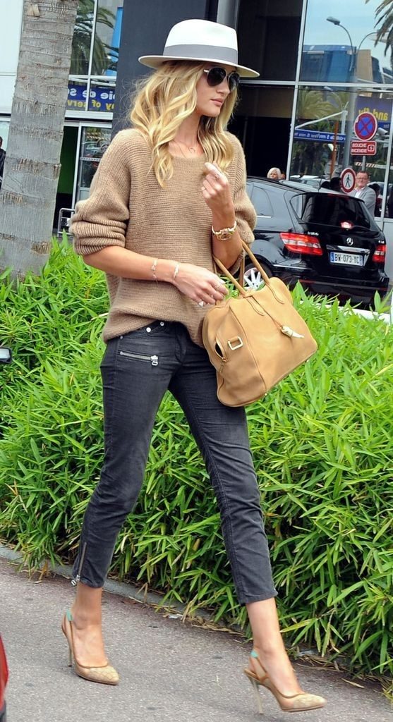
OAK BUFF 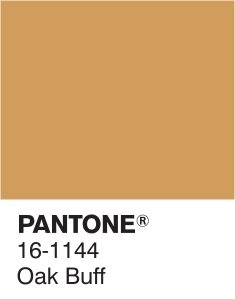
Where Stormy Weather offers a powerful sense to an outfit, Oak Buff leans more on looking relaxed and comfortable. The shade is warming and mellow–something you would want to give off on those occasional bright days during autumn. Along with Desert Sage, it’s one of the few light and dull shades in this list.
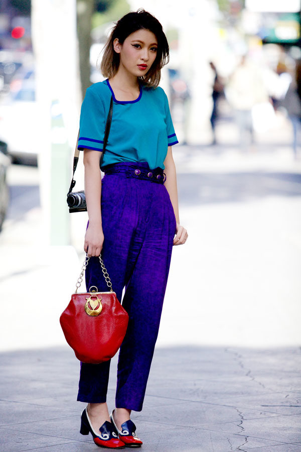
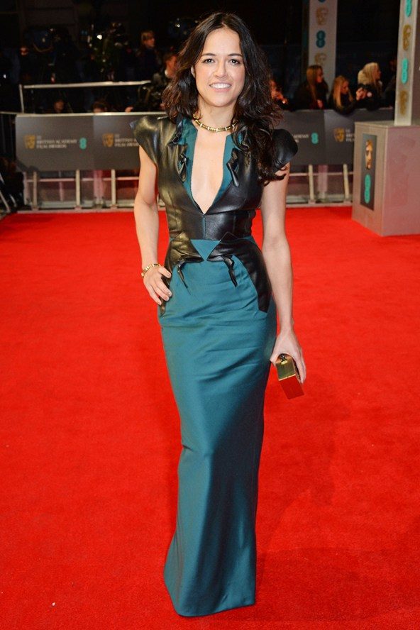
BISCAY BAY 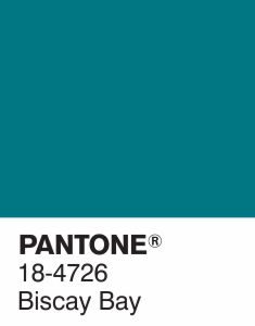
I’d like to think of Biscay Bay as this deeper and darker shade of turquoise which, if you think about it, makes sense since they both depict marine colors. The great thing about this splash of blue and green, in comparison to turquoise, is how wearable it is for the fall season. Whereas turquoise are often too bright for the season.
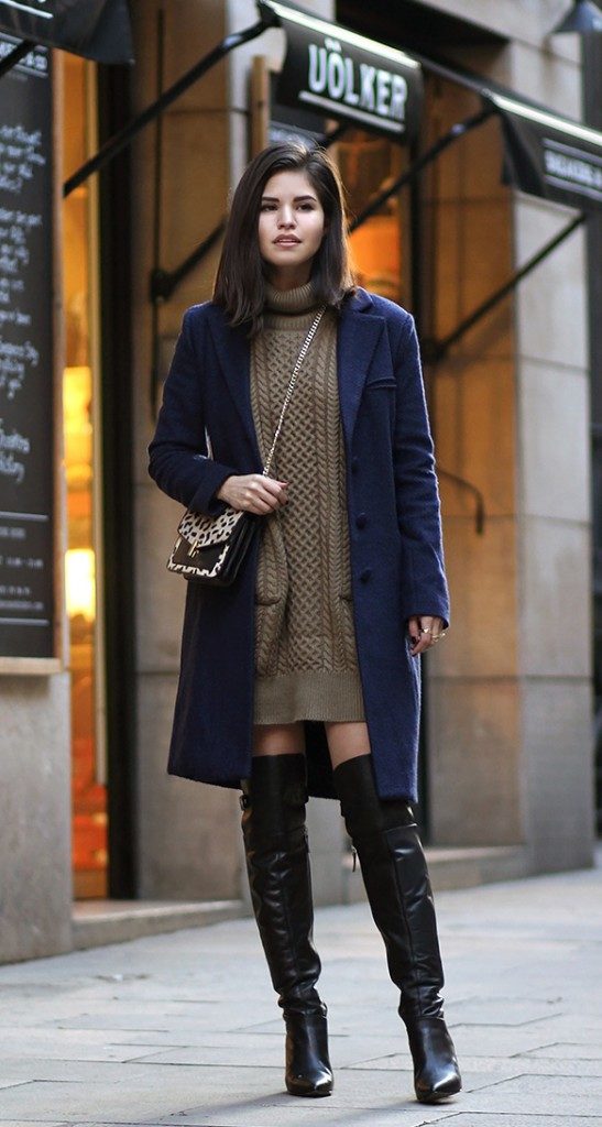
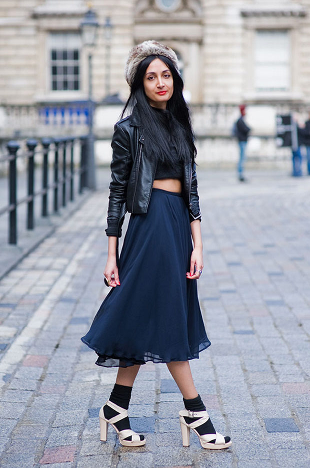
REFLECTING POND 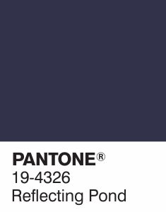
I see Reflecting Pond as 99% navy and 1% greenish blue. There is a certain depth on the color while also instigating a natural feel of deep ocean waters. The shade is a serious tone with a sweep of elegance especially when used in a glossy textile.
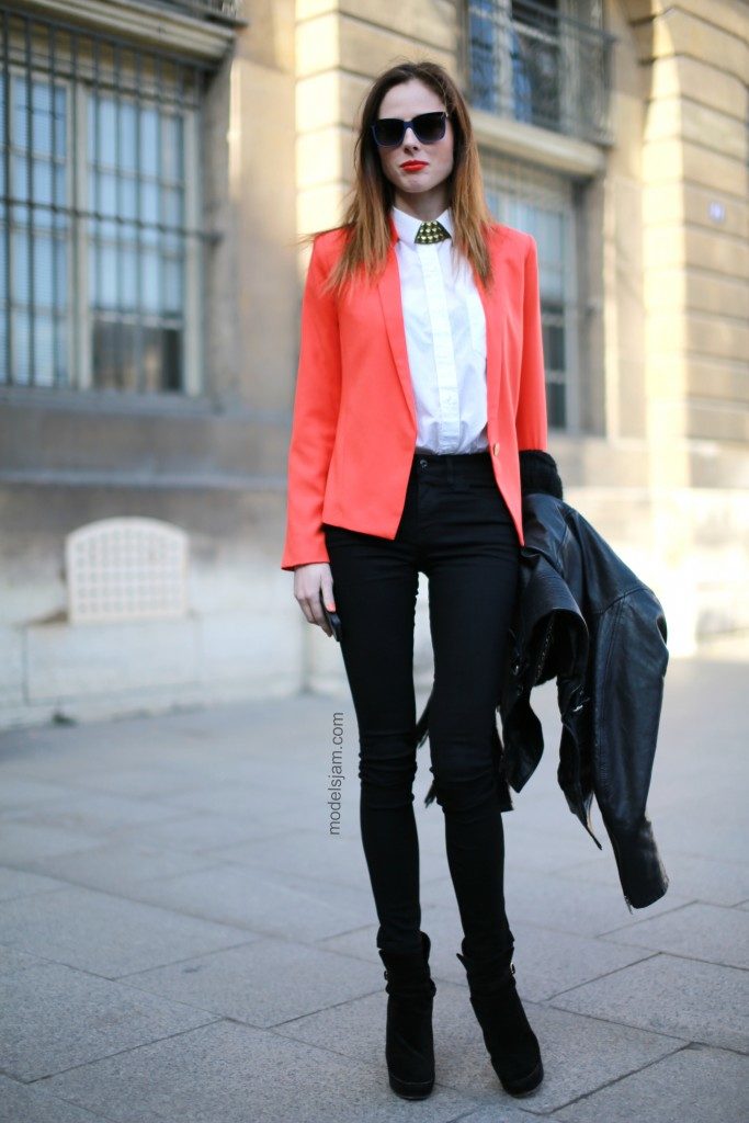
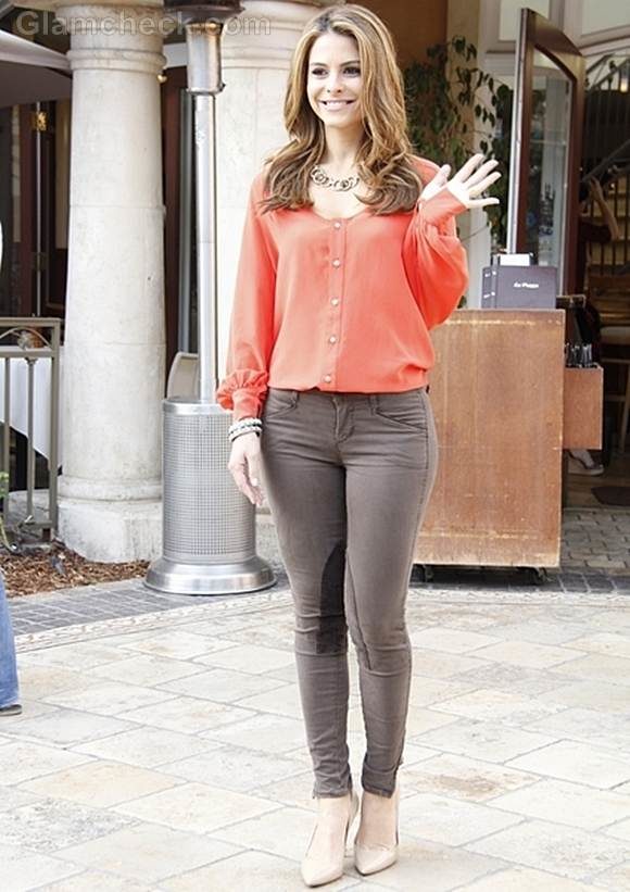
CADMIUM ORANGE 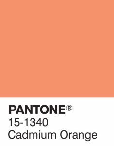
This is the only bright color in the 10 fall color trends in this list. And hey, we need some brightening up on our wardrobe too, right? Having this color in the list is an evidence of this season’s obvious nod to the ’60s and ’70s–two decades of bold experimentations and playfully contrasting colors. Cadmium Orange is very much that: bold, playful and contrasting. And it is also a great color to highlight on your fall outfits.
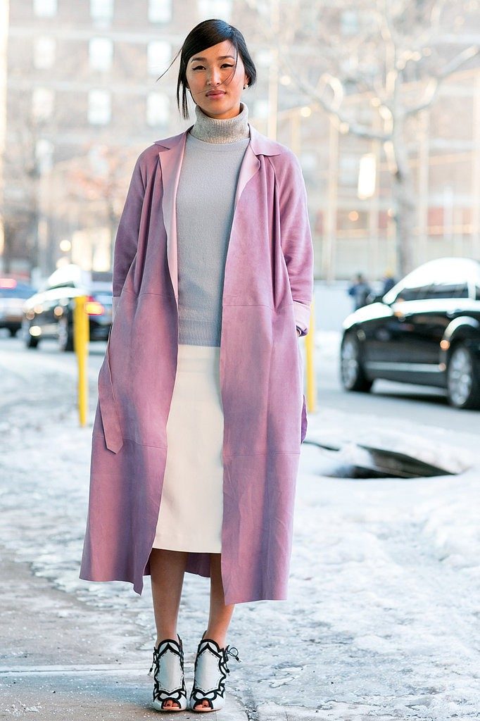
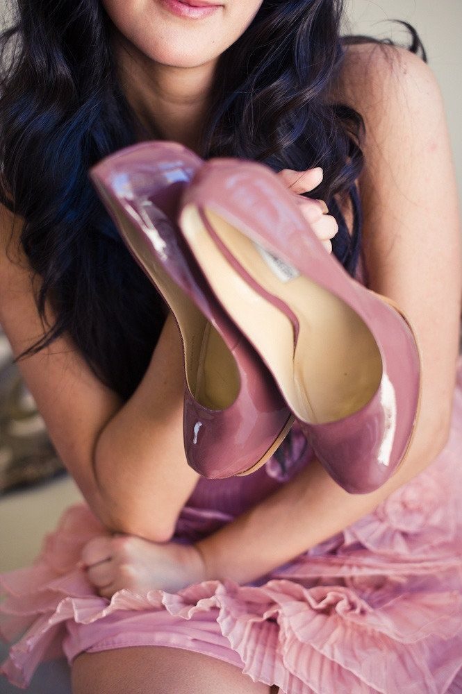
CASHMERE ROSE 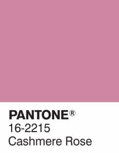
Personally, this is my most favorite color of all the ten hues in this list. And that’s saying something because I love all of them. Cashmere Rose is a dainty shade of pink with an ounce of purple tint. The color is slightly soft and gives a more upscale feel to an outfit. This shade of pink is totally perfect for those grownups who want to add pink into their wardrobe without looking like a kid.
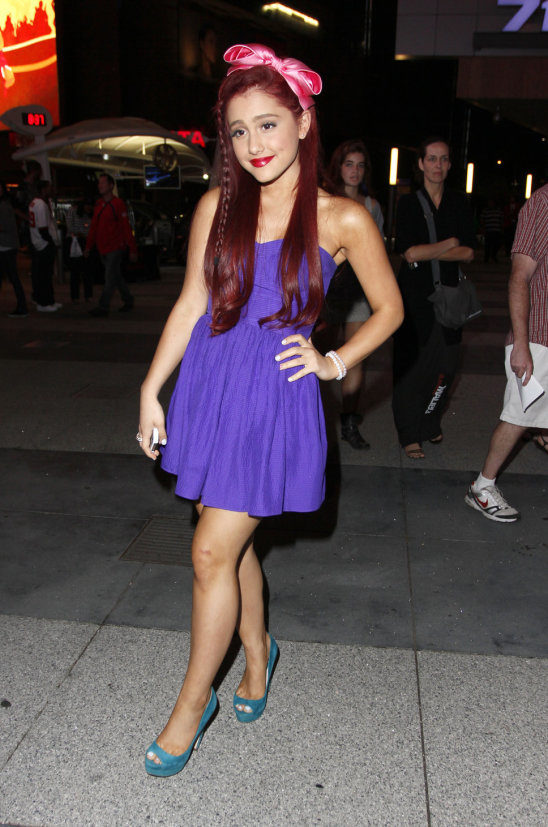
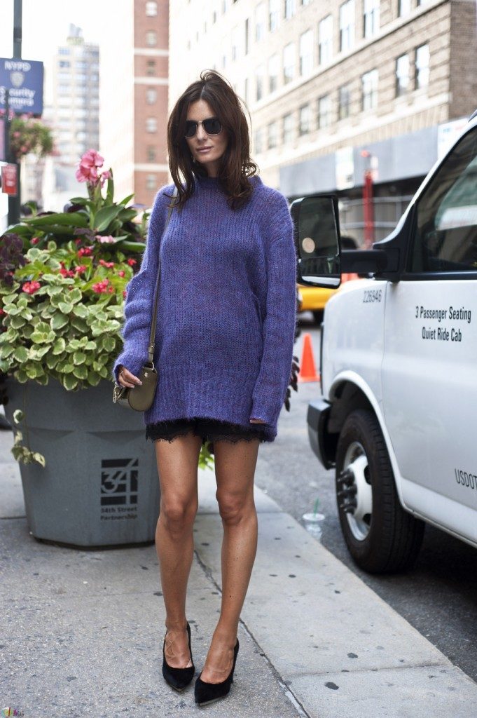
AMETHYST ORCHID 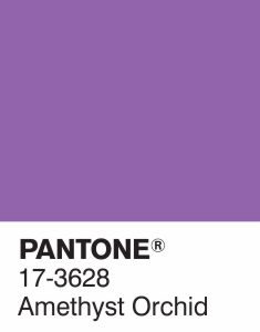
Just recently, I tackled on jewel tones and how to wear them casually. One of those tones is amethyst purple. Now, both Amethyst Orchid and Purple are similar in having Amethyst on their names and a shade of purple. Where they differ is the colors’ darkness and depth. Amethyst Purple is deep and glossy, as it is a jewel tone, whilst Amethyst Orchid is a vibrant and enigmatic color that needs very little effort to stand out.